This week, the French are voting for the first round of the presidential elections. It’s coming at a moment no one could have predicted as this tense, with Europe trying to wean off of its Russian energy dependency as Russia is invading Ukraine. This has been one of the foremost issue in the recent weeks, all but eclipsing the rest of the election topics, and the corollary of gas prices has been at the forefront of the campaign (which is, in all honesty, a refreshing change from the usual fare of immigration and public safety).
Now, I’m going to give out my age here, but my first election as a voter was in 2002. Twenty years later, the front runners are more or less the same, but with a generational (and talent) gap. Polls are giving Macron, the incumber, and Marine Le Pen ahead, followed closely by Jean-Luc Mélenchon (who is actually the only one in this election who is not a somewhat new face from the early 2000s).
Before the war in Ukraine, Macron had already heavily played his hands so that Marine Le Pen would be his opponent in the second round of the election. As a reminder, French presidential elections are in two rounds: the first round determines who amongst the dozen or so candidates goes onto the second round, and the second round is about who is the best of the two. A few additional rules are of interest: to run for the presidency in France you need to be French (duh), at least 18 of age, be a legal voter, never have been found guilty of a crime, and be of “good moral standing” (although that’s not defined). You also need, and this has been the case for a while now, to find at least 500 elected representatives to sponsor your candidacy–this was explicitly implemented with the goal to avoid prank candidacies, but this year it kept left-wing former minister of justice and MP Christiane Taubira from running.
The French electoral system recognizes what it calls “le vote blanc”, white voting, or the action of not selecting either candidates, but it also does not provide a minimum percentage for an election, nor does it count the white vote in any significant way–a candidate could theoretically be elected with only 5% of eligible voters, and, let’s say, 65% of white vote as well as 30% of abstention, although that has never happened for a couple of reasons: one is that voter registration is now automatic in France, IDs are free of charge, and every eligible voter on the list receives a packet with election dates and election candidates. Each packet contains a paper bulletin (with only one name on it, none of the complicated card systems the US has), and flyers from the candidates presenting their programs. For the national elections, those are always, by law, in French, but since the 1990s, some candidates to local elections have chosen to have their program translated in regional languages (particularly in Corsica and Alsace, regions where local dialects are still very vibrant).
These are the basics of the presidential elections.
Now onto what really interests me here: the flyers!
I have just received them (as an eligible voter living in the US, I am voting in Jersey City, as my district–the Northeast and Atlantic Region–is dependent upon the New York Consulate for all things but vital statistics. I am not going to complain though, some people have to drive upwards of 5 or 6 hours to vote).
Here is my readout of them, an exercise I do every year with my students (or on social media), and a little context for each.
I am not a communication specialist, but I have a background in history, and I have taught French for marketing purposes before–I am also a pop culture aficionado and a literature and language professor, so I’d like to think that while I am not an expert, I do have some expertise in related domains. Those are not in any particular order of preference, in terms of politics, they are ranked by how well they’ve attracted my eye, or how good they are compared to previous campaign posters/flyers. I will also state right away that I disagree with most of the things written in this article, where a French public radio gave these poster to a communication consultant, and although her insight is valuable, it’s also short-sighted in a number of ways (I do have a tendency to be very frank, that’s my Alsatian side), not the very least because it’s written from the point of view of someone who is not a historian, and someone who is very Paris-centered in her analysis (her contention that one of the candidates speaks French badly, while the transcript is riddled with grammatical mistakes and her way of speaking is really not that great, grammatically speaking, stems not from an objective description, but from the fact that the poor chap happens to have–o tempora, o mores–an accent. How dare he sound provincial!).
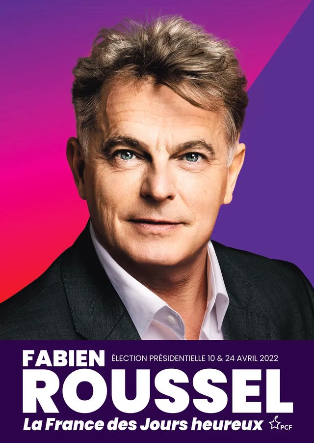
First up, Fabien Roussel. I’ll put the street poster below (the flyer looks exactly the same, and the quality is better than what I could do taking a pic with my phone). I’ll give you a few seconds to guess which political party this person belongs to.

If the small lettering in the bottom right corner did not give it away, this is the Communist Party candidate (PF= Parti communiste Français). A couple of notes and first impressions: at first viewing, this is not at all like the usual fare for the PC, and it doesn’t especially scream “The People” (which our consultant rightfully noted, but she missed the historical reference of the slogan). The PC’s historical color palette has always been, of course, a deep red. The French Communist Party does not use, and has not used, the sickle and the hammer symbol since the 1970s or thereabout, after the revelation of Stalin’s crimes. It has used the terminology PCF, with the French added, ever since that time too, to distance itself from the Soviet crimes. It was an abundant symbol in the 1920s, and the 1930s, but after the war posters essentially revolved on Maurice Thorez, head figure of the party, and an extremely popular one at that, and on symbolic “worker figures”. Soviet art is, and has always been very color-coded and geometrical, so the PCF was in this line, with very bright color and simple lines. Even though the posters switched to photography in the current era of politics, they kept that simplicity and geometry until roughly the late 1980s. The use of photography as a persuasive mean has made them a bit messier, but this poster above goes back to a long and cherished tradition of the party, although it differs starkly in the color-code it uses there, with a fuchsia and purple dominant background.
For reference, here are a couple of posters from different eras (you can toggle between the different eras by moving the vertical cursor):
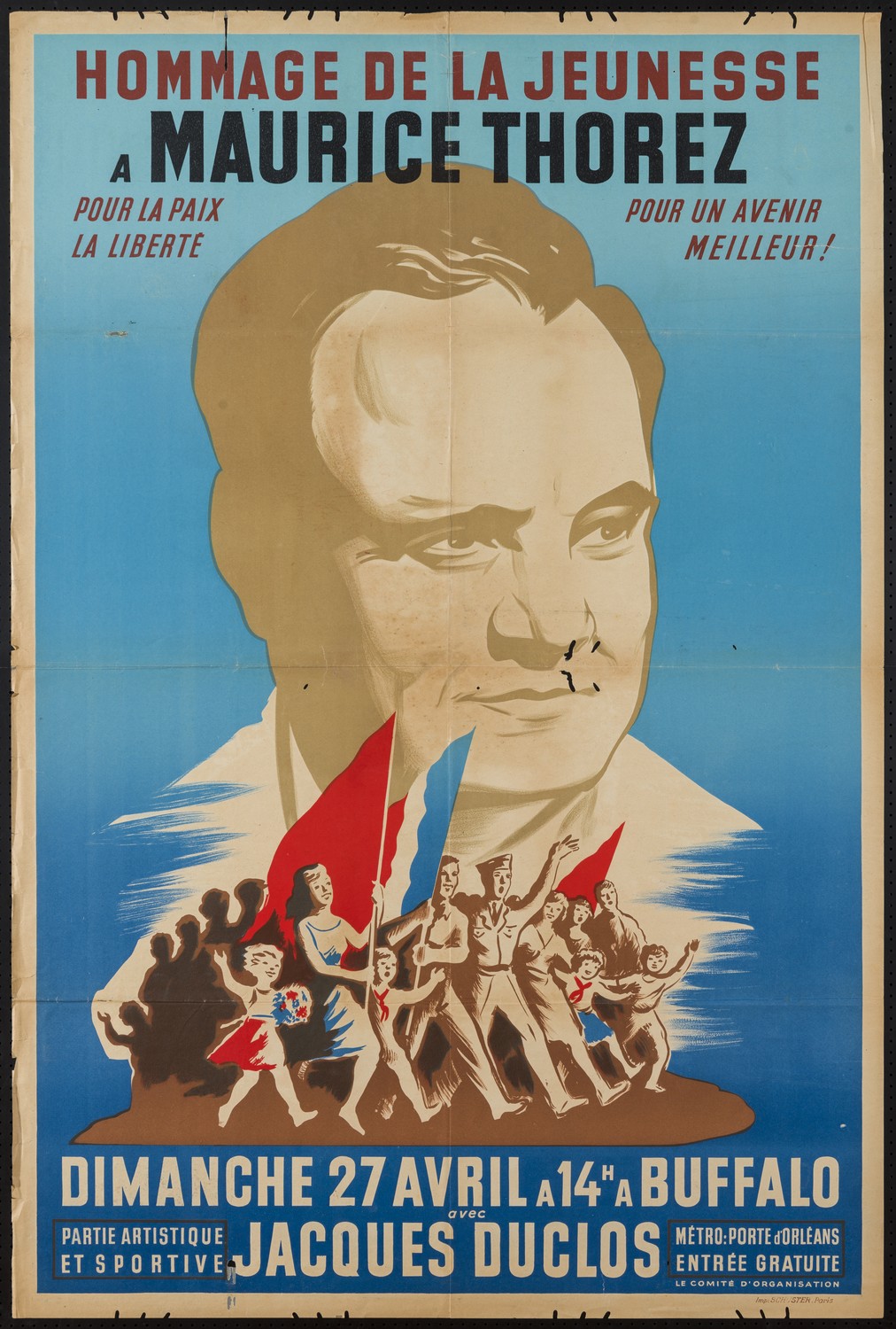
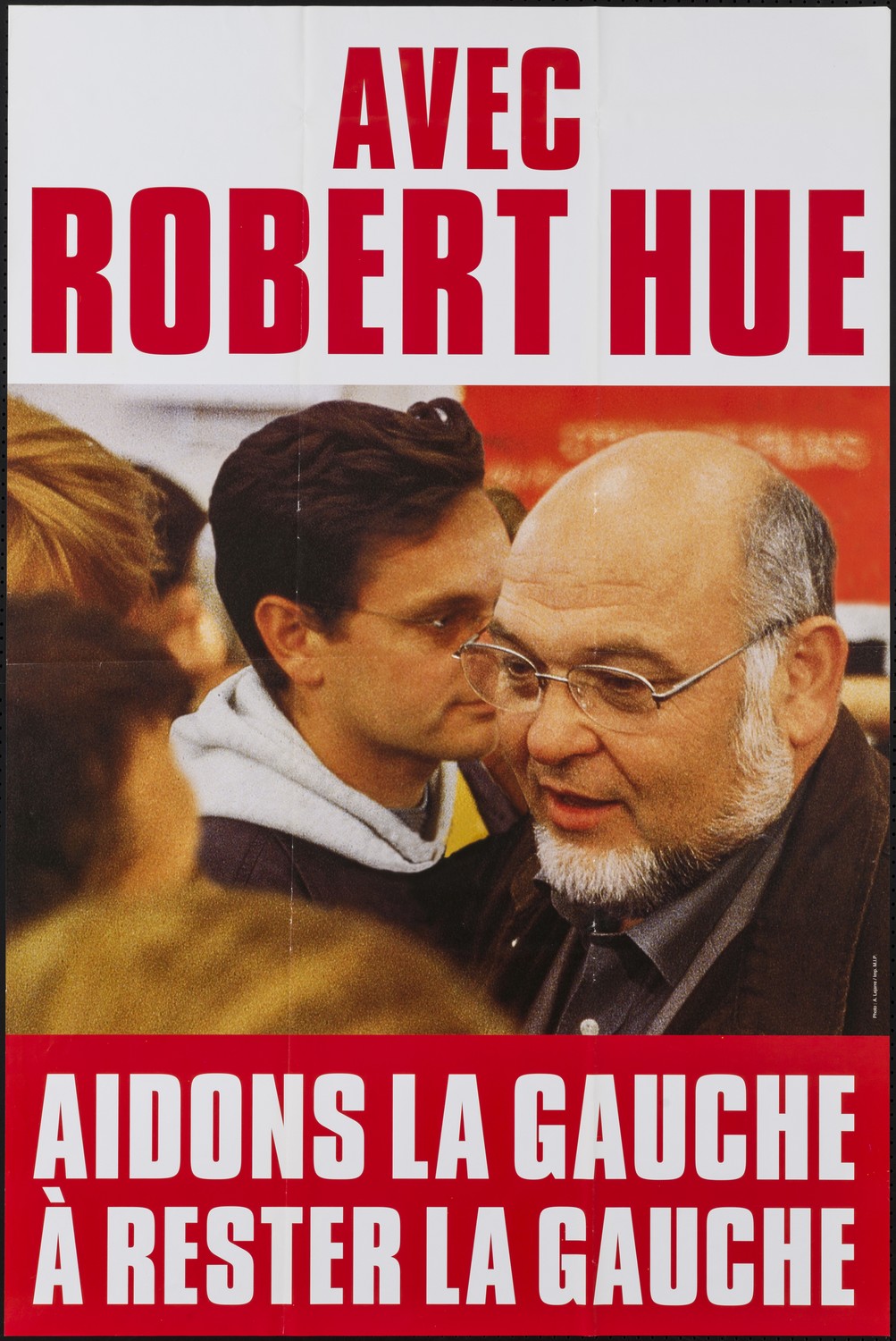
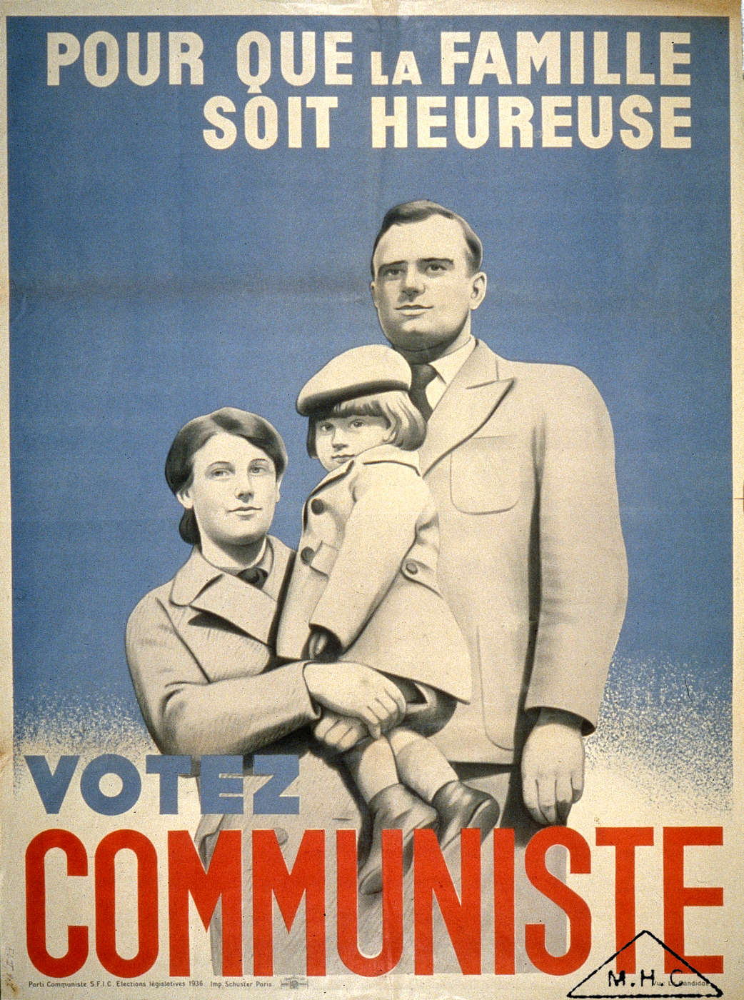
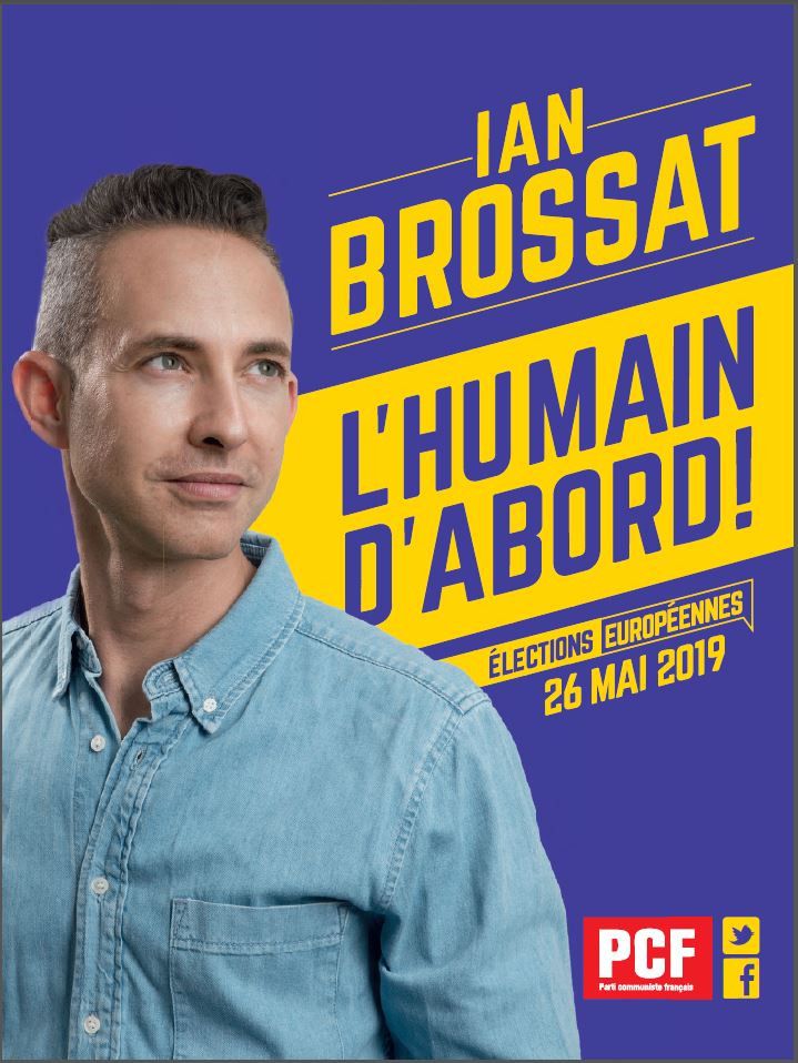
Another note: the PCF was the king of personality-cult type of poster (see this page for a more extensive comment on this, as well as a couple of references of books on the subject of Soviet-era PCF flyers), so it’s not entirely out of character for them to have a poster centered around a person, although the historical candidate of the 1990s, Robert Hue, chose often to have a crowd around him, but that also corresponded to his jovial and communicative character–Maurice Thorez had crowds below him, as any respectable cult-leader would. No crowd here, but the poster’s full face reminds me of the full face, single-figure posters of the 1930s-1950s, often featuring families. The intent is slightly different, as these would often look above the audience to the future, but it wants to be hopeful. This corresponds to the slogan, La France des Jours Heureux, which any respectable French historian will immediately recognize as similar to the 1936 Left Front (le Front Populaire) sort of vocabulary.
The suit–well the suit doesn’t scream blue-collar worker (and we will see that other popular, left wing parties use that to their advantage), but I disagree that it screams antithetical to a popular (populist?) imagery.
First-of-all, once and for all, can we dispel the notion that all politics can do the “Bernie Sanders at the inauguration look”? Imagine if Michelle O or AOC had shown up in old pants, a North Face winter coat, and homemade mittens at the inauguration in 2016. The press would have gone WILD. Every female politician (except Arlette Laguiller in her later years, but that’s a debate for another time) knows that if they show up in anything less than a suit, they’ll be crucified–if you have a medium handy, ask Meg Thatcher what she thinks of the idea that a woman can be in politics without heavily coded clothing.
Second-of-all, I think it’s presumptuous and classist to assume that someone who is poor is necessarily badly dressed–it’s about as classist as the numerous posts I saw during the Yellow Jacket movement in France that mocked the strikers for having iPhones. There is this thing called credit y’all. I own an iPad Air, an iPhone, and an SUV, all bought with credit cause I don’t have that kind of money. Note that Fabien Roussel is the son of a L’Humanité journalist–the newspaper that was the PC official organ, and is owned in a coop by its reporters. He certainly isn’t dirt poor, and there is something to be said for having an actual blue-collar worker at the head of the PC. But by the same token, he isn’t a business CEO, and I actually find annoying the idea that someone in a good suit cannot possibly be blue-collar. My grandpa, a mason and stoneworker, rocked his suit, y’all.
The gist of it: it’s a modern flyer that also calls back cleverly to previous design codes of the party. Its slogan is retro without being nationalistic retro, although it’s perhaps too cryptic at this point. Not that I would ever vote for this guy, but he manages to make himself look warm, and call back to an era of social prosperity where his party helped chip away at inequality, so that’s always great. Honestly, I pick this one as my top contender for best flyer, not because it is inherently great (it has many flaws, one of which being that it is way too complicated to read for a political poster), but because this year all the others are so dull and lifeless, it’s going to take all of my willpower to go through the flyers and programs, so I give this one props for being actually interesting visually.
Part 2: Marine Le Pen’s poster

Leave a comment